Logo Redesign
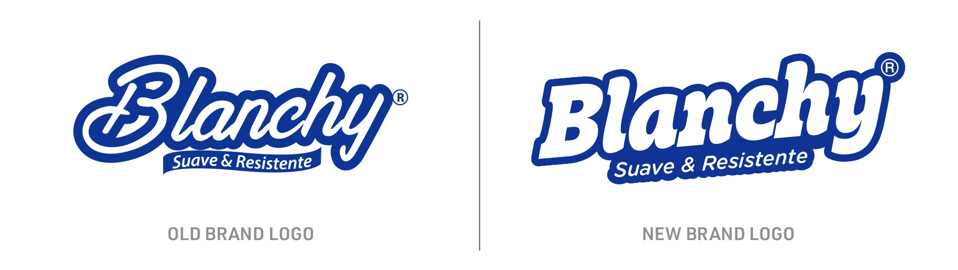
To strengthen Blanchy’s presence on store shelves, I proposed a logo redesign. The new mark is clearer and more legible, with a bolder, more impactful presence and greater versatility across packaging and brand applications.

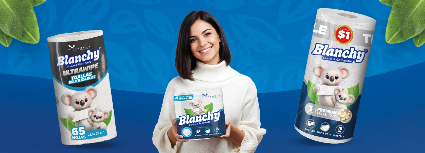
La Reforma is a paper products manufacturer specializing in toilet paper and paper towels. Its portfolio includes its own brands and products for retail partners in Ecuador and Panama.
To strengthen Blanchy’s presence on store shelves, I proposed a logo redesign. The new mark is clearer and more legible, with a bolder, more impactful presence and greater versatility across packaging and brand applications.
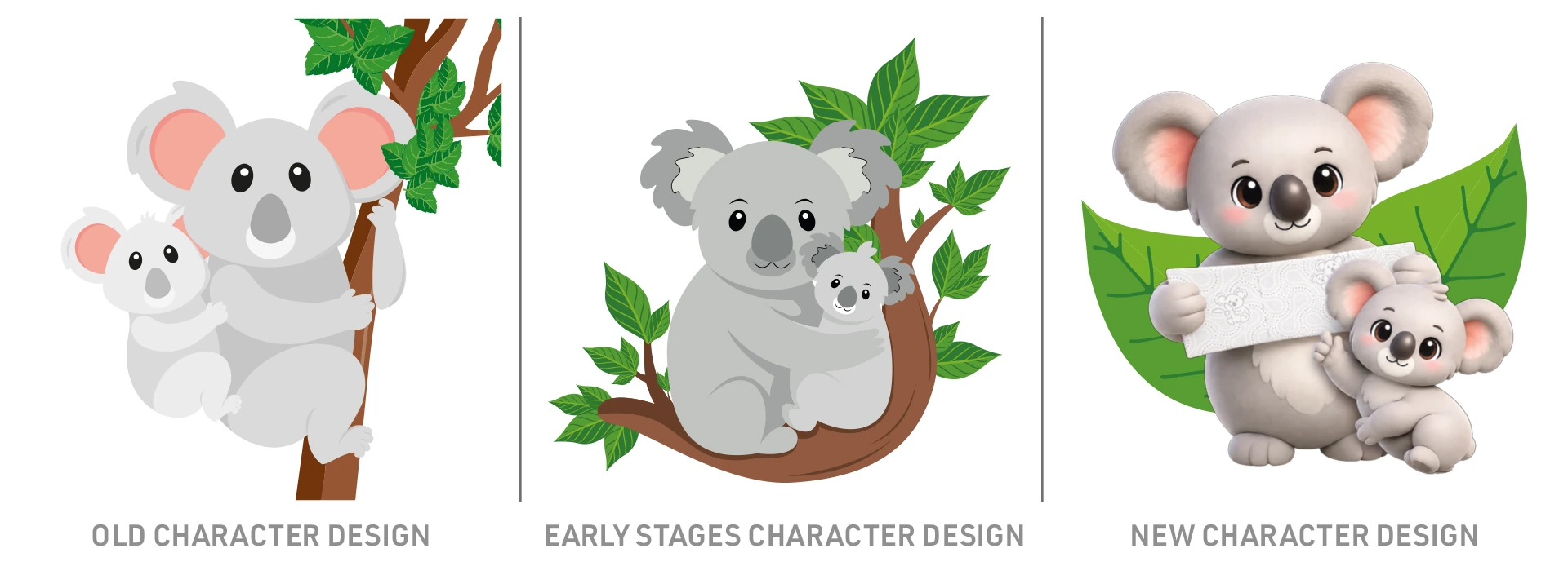
Blanchy’s mascot has been a brand staple for years, much like Scott’s iconic Golden Retriever. The original character was designed for a vertical format, which limited how it could be used. The new 3D model feels more contemporary and adapts easily to different layouts, while integrating naturally with the redesigned logo.
Click or tap a picture to expand
Click or tap a picture to expand
Click or tap a picture to expand
Video plays automatically when visible